What Should a Coaching Website Include to Book More Calls?

Web Design

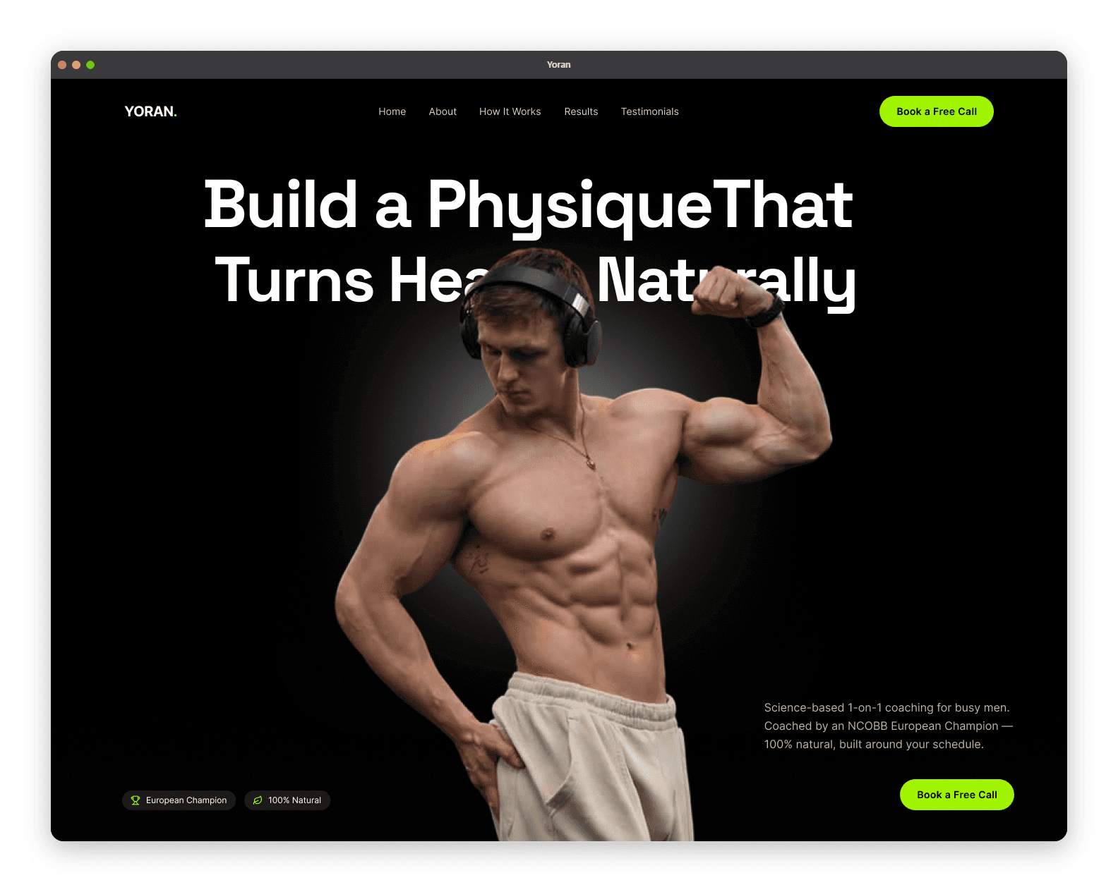
A coaching website needs six things to book calls consistently: an outcome-driven headline, one obvious call-to-action, an offer section framed around client results, real proof, a human About that builds trust, and a fast, mobile-first build. That's the whole list. Everything else is optional decoration — and missing any one of the six leaks calls you already earned.
Most coaching sites don't fail because they're missing features. They fail because they have twelve things fighting for attention and none of the six that matter doing their job. This is the conversion-first blueprint: what each element must accomplish, and the order to put them in.
What's the one job of a coaching website?
Before the checklist, get the frame right: a coaching website has exactly one job — move a warm visitor to a single action, usually booking a call or joining a waitlist. Not "showcase your brand." Not "explain everything about coaching." One job.
This matters because most sites fail by trying to do too much at once — brand showcase, full methodology explainer, blog, shop, and booking page all shouting together. When everything is emphasised, nothing is. Every element below earns its place only if it moves the visitor toward that one action. If it doesn't, cut it. (This is also the deeper reason sites don't convert — clutter, not ugliness.)
The homepage hero: what makes it convert?
Your hero — the first screen a visitor sees — does more for your bookings than the rest of the site combined, because most visitors decide whether to keep reading in seconds. It needs three things:
A headline naming your person and their outcome. Not "unlock your potential." Something like "Helping desk-bound professionals fix their posture and build strength in 30 minutes a day." Specific enough that the right prospect thinks "that's me."
A one-line subhead that adds the how or the proof ("1:1 online coaching, built around your schedule — no gym required").
One primary call-to-action button, visible without scrolling ("Book a free call").
If your hero is a pretty photo and a vague slogan, you're losing people before they ever reach your good stuff. Lead with the outcome, not the aesthetic.
What should your services or offer section say?
Here's where coaches lose the most bookings: they describe their process (session structure, methodology, credentials) when the visitor only cares about the outcome — what their life looks like after working with you.
Flip it. Frame each offer around the transformation: where the client is now, where they'll be, and what's included to get them there. Name the deliverables (calls, plans, check-ins, messaging access) so the value is tangible — this is also where you quietly answer the prospect's private "is this actually worth it?" question. If you have tiers, keep them to two or three; more than that creates decision paralysis, and a paralysed visitor doesn't book.
Credentials belong here too — but as support for the outcome, not the headline. "NASM-certified, 8 years, 200+ clients" reassures. It just shouldn't be the first thing you say.
How much proof do you need — and what kind?
Enough that a stranger who's never met you believes you can deliver. Proof is the difference between a site people like and a site people act on. The strongest kinds, roughly in order:
Specific results / before-and-afters — especially powerful in fitness. "Lost 14kg in five months and kept it off" beats any adjective.
Named testimonials with a face and a concrete outcome.
A Google Business Profile with reviews — a third-party signal humans and AI both trust.
Recognisable logos or affiliations, if you have them.
Generic praise ("great coach!") is nearly worthless. Specific, outcome-shaped proof does the persuading. Scatter it down the page near each decision point, not quarantined on a separate "testimonials" tab nobody visits.
What does your About page actually need to do?
Counter-intuitively, your About page isn't about you — it's about why you are the right person for their problem. Coaches sabotage this by writing a corporate third-person bio to seem bigger. Prospects want a relationship with a person, not a faceless company, so the third-person voice quietly costs you trust.
A converting About does three things: shows your face (people book people), connects your story to their struggle ("I spent years training wrong too — here's what changed"), and stacks credibility in service of their outcome. End it with a call-to-action, because an engaged reader on your About page is a warm lead you shouldn't strand.
Where do the calls-to-action go?
Everywhere a visitor might be ready to act — but always the same one action. Hero, after the offer section, after the proof, and at the foot of the About and any page. A visitor convinced at the testimonials shouldn't have to scroll hunting for the button.
The rule: one action, repeated; never a menu of competing choices. "Book a call" and "download the guide" and "join the newsletter" and "follow me" on the same screen splits attention and lowers every one of them. Pick the primary action, make it unmissable, and let a single low-commitment secondary option (a lead magnet) catch the not-yet-ready.
What can you leave out?
Most of what coaches agonise over:
A giant multi-page site. A sharp home, an offer page, and proof out-book a ten-page site. Many coaches convert fine on a single well-structured page.
A blog you won't maintain. One is great for SEO if you'll feed it (it's how you get found by Google and AI); a stale three-post blog just signals neglect.
Explaining what coaching is. Your prospect knows. Talk about their problem, not the category.
Heavy animations and decoration that slow the page and distract from the button.
Subtraction is a conversion strategy. Every element you remove makes the ones that matter louder.
The order that actually matters
Structure the flow like an argument that ends in a booking:
Hero — problem + outcome + CTA
Offer — the transformation and what's included
Proof — results and testimonials
About — why you, in service of them
Objection-handler / FAQ — kill the "is it worth it?" doubt
Final CTA — one clear next step
That sequence walks a visitor from "this is for me" to "I trust this person" to "I'm booking" — which is the entire job. Build it on a fast, low-maintenance platform so speed never undercuts the structure, and budget for the strategy, not just the build.
Want us to map this structure onto your offer and build it to convert? Book a free call — or see how we've done it for coaches in our work.
FAQ
What should every coaching website include?
Six essentials: an outcome-driven headline, one obvious call-to-action, an offer section framed around client results, real proof (testimonials and results), a human About that builds trust, and a fast, mobile-first build. Everything else is optional.
How many pages does a coaching website need?
Fewer than most coaches think. A sharp homepage, an offer page, and proof will out-book a large multi-page site — and many coaches convert well on a single well-structured page. Add pages only when each one moves a visitor toward booking.
What should a coaching homepage hero section say?
Three things: a headline naming your specific client and their outcome, a one-line subhead adding the how or proof, and one visible call-to-action button. Avoid vague slogans and lead with the client's outcome rather than an aesthetic photo.
Should a coaching website focus on the coach or the client?
The client. Copy that centres your process and credentials loses to copy that names the client's problem and desired outcome. Credentials belong on the page as support for the outcome, not as the headline.
Do I need a blog on my coaching website?
Only if you'll maintain it. A regularly updated blog helps you get found on Google and by AI answer engines, but a stale, abandoned blog signals neglect. If you can't feed it consistently, leave it off and focus on your conversion pages.
Where should I put calls-to-action on a coaching website?
At every natural decision point — the hero, after the offer, after the proof, and at the foot of key pages — but always the same single action. Repeating one clear CTA converts better than offering a menu of competing options.

Muneeb Bhatti


